Welcome Contributors

 This page is designed to provide basic guidance and assistance with creating content for some content types on this site using the Drupal CMS. For more details on the web framework, code snippets, usability/accessibility guidelines, best practices and technical information, visit the Design System (coming soon).

Expand All

General notes

Things to note when working with most content types.

  • Header background graphics and sector icons are added automatically based on the sector selected from the sector/industry drop-down. This is applicable for all content types (except General) that utilize this pick-list.
  • The default colour theme for the site is the generic blue header and colour. Use the sector/industry drop-down to assign the appropriate corresponding sector design theme. Note that selecting "other sectors" will also assign the generic blue theme.
  • You may override a header background image by browsing and adding an image from the Media Library or by uploading a JPEG, PNG or SVG file format. (Add suggested size and aspect ratio format)
  • A colour theme is applied to certain elements such as cards, some glyphs and buttons when the sector/industry drop-down is selected. These are elements on the page that are styled with the ofb- prefixed colour classes. 
  • To stop the colour theme from affecting any of the elements listed above that as an ofb- prefixed class, add "no-style" to the class attribute.
  • Theme colour styles can be applied to various elements on a page see the list of colour styles below. These styles use a !important flag to override framework styles as well.
  • A URL Alias is generated from the title of a page. You can control the URL alias by editing it from the URL Alias option on the sidebar options. 

    url alias

Important: Switching text editor mode between the IDE editor format and Full HTML format will affect your code. CKEditor does not preserve PHP codes and they will be commented out or removed. 

CKEditor will also remove empty and malformed HTML tags.

Creating a Standard or Type 1 event page

A standard or Type 1 event page has a URL pattern like this: 

English:

https://stage.sourcefromontario.com/en/page/event/104716/mission-biotech-showcase

French: 

https://stage.sourcefromontario.com/fr/page/event/104717/mission-commerciale-biotech-showcase

The event ID forms part of the url e.g. 104716 or 104717. The ID is important for making the relationship with companies that will be attached and displayed on these pages. In most cases the event ID will be the same as the Node ID for the page. 

Setting up a Redirect for a Vanity URL

If a vanity URL is required for a standard or type 1 event page a Redirect has to be created. This can be done from the URL Redirect options on the side bar. Below is an example of how to set this up using Biotech event as a case study.

Vanity URL English: https://stage.sourcefromontario.com/biotech

Vanity URL French: https://stage.sourcefromontario.com/fr/biotech

Add the vanity name "biotech" in the PATH field.

Note that the Node ID in the TO field will automatically map to the URL alias that is set for the respective languages for the page.

Leave the Redirect status on the default 301 Moved Permanently.

Finally, set the Language option to "All languages", this way the same vanity name will be redirected to the French URL when the language ID is prepended to the vanity name in the PATH field.

url redirect settings image

Using a jQuery Drop-in

You can drop in the total number of companies or participants associated with the event into a sentence in any paragraph by adding the following html tags in the desired place. This will ensure that the number increments or decrement dynamically:

Example of use:

View total count

The display:

View total count

Creating a Company Profile

Using the Event ID field

The event ID is used to group companies/organizations together for display on a type 1 or type 2 event page. The ID is located in the event page URL after event/ as in the case below it is 104716. Note that type 2 event pages do not have an event ID in their URL pattern, but this is addressed under creating a type 2 event landing page.

https://stage.sourcefromontario.com/en/page/event/104716/mission-biotech-showcase

Using the Event Tag Field

The event tag field is used to identify companies that are presenting or otherwise not part of the Ontario delegation attending a trade show led by a Trade Officer.

Companies/Organizations that have been tagged as "Event Participant" in this field will appear in the Participants carousel on a Type 2 landing page. Companies without the tag will appear in the Companies carousel on a Type 2 landing page. More details about this can be found under the Creating a Type 2 Event Landing Page.

Creating a Type 2 Event Landing Page

Type 2 Event pages are Landing pages. These are used primarily as promotional URLs and are always created with a vanity URL

A type 2 event pages pulls together companies/organizations from two type 1 events, and often consists of the following content/design components:

  • an introduction
  • description of delegate companies
  • carousel of delegate companies
  • description of presenter companies/organizations
  • carousel of presenter companies/organizations
  • related content carousel
  • side bar items

Companies associated with the type 1 events are displayed in the respective carousels shown below. Company/Organizations profiles that have the Event Participant tag in the Event Tag field will be placed in the Participants carousel. Companies without this Event Tag will be placed in the Companies carousel. 

Adding the Event Node ID and Event Tag

Event ID

Enter the event ID for a type 1 event is required to enable companies and organizations to display in the respective carousels. You can use a pipe separator for multiple IDs e.g. 33200|33201

Event Tag

Ensure that the Event Tag field has the "Event Participant" tag in it. This is required for the carousels to segment the companies and organizations based on the matching tag that were placed on the companies/organizations in the company profile setup.

Adding the carousels

In order for the carousel to be displayed beneath its describing paragraph a php snippet as shown below will be added to the source code of the body field. The code should be added using the Text Format IDE at the bottom of the content area.

text editor format

To add the companies carousel insert the following below the closing </p> tag of the describing paragraph:

Companies Carousel

companies carousel

To display the participants carousel, insert the following php code snippet below the closing </p> tag of the describing paragraph:

Participants Carousel

participants carousel

To display both the Participants and Companies in grid format, insert the following php code snippet below the closing </p> tag of the describing paragraph:

Participants and Companies grid format

companies carousel

Using a jQuery Drop-in

You can drop in the total number of companies (total_delegates) or participants/presenters (total_presenters) into a sentence in their respective paragraphs by adding the following html tags in the desired place:

For companies (delegates)

Example of use:

code view for the delegates drop-in

The display:

showing the output of a drop-in for the delegates description paragraph


For Participants/Presenters

Example of use:

code view for the participants drop-in

The display:

showing the output of a drop-in for the participant description paragraph

The event side bar allows the addition of a single event logo for the event organizer with or without a hyperlink to their website.

Multiple customizable items can be added on an event side bar, with or without pre-formatted buttons and in some cases text areas can accommodate HTML. Text fields for titles (like downloadable assets) can also accommodate HTML so things like abbreviation tags <abbr> can be added.

The order of the side bar and downloadable assets blocks have some flexibility and can be rearranged as also in cases where a handle Handle widgetwidget is present for items within a block. The event logo area will always be fixed at the top and the date of the event will appear beneath it.

Items can also be rearranged using the "Show row weights" link within a side bar or downloadable asset group. This will disable the handle widget and provide a drop-down list with 0 positive and negative numbers to choose from. Items with higher values will appear at the top lower values will appear below. If all the items are set to "0" the default layout order will be maintained. Using the Show row weights can be useful in situations where the item group is too tall to allow for dragging and rearranging.

In responsive mode, the event logo and date will be removed from the top of the side bar and inserted beneath the first paragraph of the body with an "intro" class tag.

Side bar column layout structure

Event meta data region only appears on standard/type 1 event pages

side bar layout structure diagram

Related contents are items that appear at the bottom of a General, Type 1 or Type 2 page. These are usually cross-links between type 1 pages, blog posts on the Invest site or other supporting pages for an event such an additional media, an agenda page or article on an external site.

Use the Related Content Content Type to add these items which consists of a short blurb description of the content, a hyperlink and optionally a thumbnail header image.

Use the related event field to attach it to multiple pages. Just type the title of the page and the autocomplete feature will show a list to choose from.

Sticky at top of lists

Use the promotion options on the options side bar to make a content appear at the beginning of lists.

Promotion options properties

Weight

Use the weight field to override the default order of the related content items. The default is 0, negative and positive numbers can be used so that the highest weights show up first in a list. This ordering will not force content that have been marked as "sticky at top of lists" to change their position on a list with non-sticky items. You can however, use it to order multiple "sticky" content items among themselves.

Adding an Intro Video

A YouTube or Vimeo video can be added above the body of a Type 1 or Type 2 page. Simply copy and paste the full URL of the video e.g. https://www.youtube.com/embed/1eGWgxcmVUg (Do not use a short URL) in the Video URL field. The video will be responsive, so it will scale to match the width of the body column despite the natural dimensions of the video.

Add the title of the video in the named field, this is not displayed visually, but is required by screen readers for accessibility purposes. 

You may also add a note for the video in the named field, such as a disclaimer or a transcript text. The text in this field can be hyperlinked to copy on another page by using the Video Note URL field.

Adding videos in the body of a page

Videos may be added into the body of a page by using the code snippets provided below.

YouTube example

<div class="row">
    <div class="col-md-12">
        <iframe class="w-100" width="100%" height="420" allow="accelerometer; autoplay; encrypted-media; gyroscope; picture-in-picture" allowfullscreen="" frameborder="0" src="https://www.youtube.com/embed/D4HlB6Tb04Q?hl=en" title="Video: Brampton Is Now | Brampton Means Business Now"></iframe>
    </div>
</div>

Vimeo example

<div class="row">
    <div class="col-md-12">
        <iframe class="w-100" width="100%" height="420" allow="autoplay; fullscreen" allowfullscreen="" frameborder="0" src="https://player.vimeo.com/video/447504638" title="Video: Life Sciences in Hamilton from Hamilton Economic Development on Vimeo"></iframe>
    </div>
</div>

Video note example

For a transcript link you can replace "note: ..." text with the word transcript (French: transcription) and add a hyperlink to the page with transcript.

<div class="row disclaimer-text">
    <div class="col-md-12">
        <p class="video-note">
            <small class="text-dark">Note: This video is hosted by a third party, and may not be available in French.</small>
        </p>
    </div>
</div>

Add images using the media library

When adding images using the Media Library options ensure that the alt tag information is added as this will be displayed for the image in the side bar or downloadable asset blocks.

If the image being added does not need another artwork for French, use the Media browser (tab under the Content menu) after the image has been uploaded to add a French translation for the alt tag and to auto generate that version.

Helpful codes and tips

Abbreviation tags

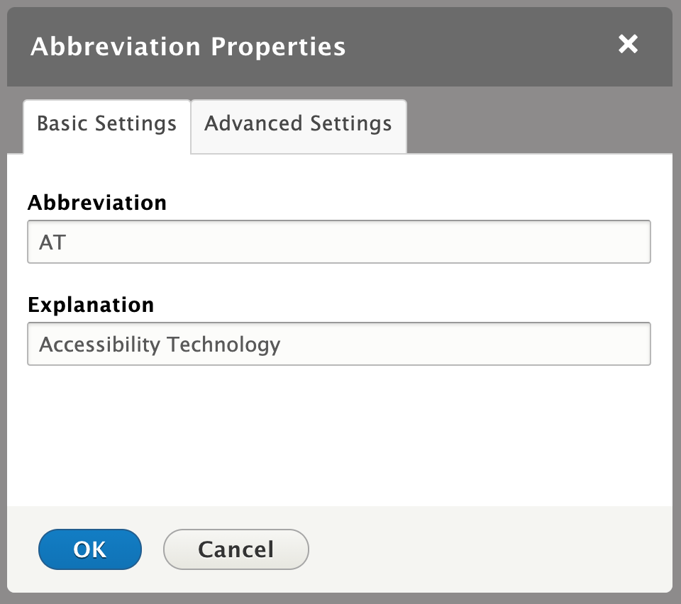
It's important for accessibility that abbreviations tags are used to provide context for users with AT (Accessibility Technology) devices.

Use the abbreviation button abberviation button iconon the Full HTML text editor menu to wrap text in an abbreviation tag or you can do it directly in the source code. When using the abbreviation button just select the text, click the button and add the title in the explanation field in the window that pops up.

Abbreviation properties modal window

Below are a few best practice examples.

Acronyms that are known and used a proper nouns in writing or conversations do not need to have an abbreviation title which would normally be required to convey additional context e.g. USA, US, U.S., WHO or UK can simply be wrapped in an <abbr> tag e.g.:

This way a screen reader will read it as letters and not try to pronounce the term.

In other cases such as where context is required, use the title attribute option within the <abbr title=""> tag to ensure that the semantic meaning of an abbreviation, symbol, scientific notation or acronym is conveyed e.g.

etc.

25 °C

OPS


Adding a button

You can change any hyperlinked text in the copy to a button style using the Full HTML editor. To add a button in the body copy do the following:

  1. highlight the word in the copy which will become the button label.
  2. Use the hyperlink button on the editor toolbar to add the link the button will point to.
  3. Use the Styles drop-down to select the Button style. The button default colour will be dark blue, but this will get changed based on the sector colour theme of the page.

This is an example:

To participate in this event Register Now!

Adding font awesome icons

As part of our framework the Font Awesome (version 4.7.0) icons can be utilized throughout the site. You can add the info icon inline with copy that provide information by creating a single space, highlighting it and applying the style from the styles drop-down on the editor toolbar.

To add additional Font Awesome icons in copy use the following code. The <i> tag that Font awesome uses should be replaced by a <span> tag that wraps a non-breaking space (&nbsp;). Note: CKEditor will remove empty tags as well as <i> tags.

The example below produces a square Linkedin icon Linkedin icon

For a full list of available icons visit Font Awesome's website.

Helper Functions

The following functions assist with quick manipulation of content or elements on a page.

Theme Colour Default

This function will reset the sector/industry colour theme for a page to the default OFB dark blue theme colour.

HTML Element Override

This function will override the contents of any specified HTML element on the page. The function accepts three arguments:

$html_wrapper: The HTML element(s) to target

$new_label_en: The replacement HTML content for the named element on an English page. Using NULL will remove the element from the DOM.

$new_label_fr: The replacement HTML for the named element on a French page. Using NULL will remove the element from the DOM.

Enter the above argument values in quotes.

Example 1

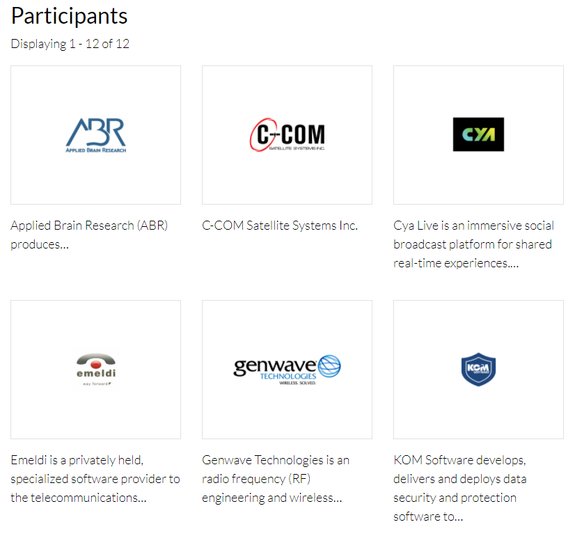
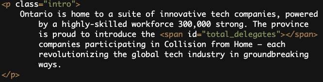
<?php html_element_override('#participant', 'Partners', 'Partenaires'); ?>

Example 2

This would remove the HTML element with the attribute id="participant" .

<?php html_element_override('#participant', null, 'Partenaires'); ?>
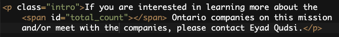
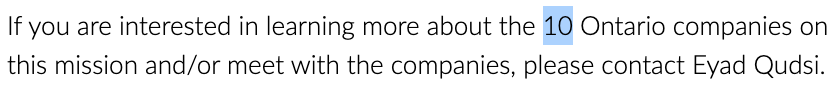
Theme colours

A full reference to theme colour classes is available on the Design Guide

Primary Colours

fuchsia, darkblue, deepgreen, burntorange, teal, purple

Colour parameters

ofb-{colour}-{colour_value}-{element}-{element_property}

ofb parameters  definition and usage
colour
 
ofb-fuchsia
 
ofb-darkblue
 
ofb-deepgreen
 
ofb-burntorange
 
ofb-teal
 
ofb-purple
All theme colours listed have an ofb- prefix. The value for these primary colours is 100%.
 colour_value ofb-{colour}-{colour_value}
This defaults to a 100% value if the parameter is not set. These values produce a solid colour, no transparency is used.
-80 ofb-{colour}-80
80% of the named primary colour
-60 ofb-{colour}-60
60% of the named primary colour
-40 ofb-{colour}-40
40% of the named primary colour
-20 ofb-{colour}-20
20% of the named primary colour
element Background, font and border colour styles.
-bkgnd

ofb-{colour}-bkgnd

Sets the background-color property of an element.
-text

ofb-{colour}-text

Sets the color property of a font.
-border

ofb-{colour}-border

Sets the border-color property of an html for all four borders. The element must have a border-width and border-style property for border colour style to be applied. 
element_property These are for border property styles.
-top ofb-{colour}-border-top
Sets the border-top property of an element. 
-right ofb-{colour}-border-right
Sets the border-right property of an element. 
-bottom ofb-{colour}-border-bottom
Sets border-bottom or property of an element.
-left ofb-{colour}-border-left
Sets the border-left property of an element. 
Secondary colours (only 100% values):
 
ofb-activeblue
 
ofb-brightblue
 
ofb-lightblue
 
ofb-deepgray
 
ofb-warmgray
 
ofb-darkgray
 
ofb-mediumgray
 
ofb-lightgray
 
ofb-red
 
ofb-darkred
 
ofb-green


Application example

Styling a div element with a preset border size and style.

e.g.: <div class="ofb-fuchsia-40-border">


e.g.: <div class="ofb-fuchsia-border-bottom"> 


Design System (coming soon)

Refer to the design system for more comprehensive information on using the bootstrap framework, theming elements, components and patterns used on this site.